Best practices for a demand gen focused website
Do you manage a B2B website like I do? Is the primary goal of your website to generate leads? If your answer is yes to both of those questions then this blog is for you. Generating demand on your website is about creating enough interest in your products or services so visitors will reach out to you for more information. The user fills out a form to give you a lead that your sales team will follow up on. There is a fine balancing act to maintain between generating leads and focusing on the quality of the lead which I will discuss as well.
I’ve been managing B2B websites for over eight years now. Here are some of the key things that I’ve found work well on my sites to drive sales-qualified leads.
Persistent header CTA (Call to action)
The one part of your website that sticks with your user everywhere they go is the site header. The header is a very important component of nearly every page — it carries the top level navigational links with the places where you want your user to go within your website. You can use the header as a demand generation tool by having your most important CTA that is applicable to all users also be available in this section. Right now on acquia.com we are using “Live Demo,” and this button uses our bright primary color to grab visitors’ attention and imply importance. Whatever piece of content is most helpful to get your prospects to evaluate your product, that should be the basis of your CTA. It could be a demo, free trial, phone number or other piece of content that is appropriate for your business. Don’t miss out on the great space available on your site.
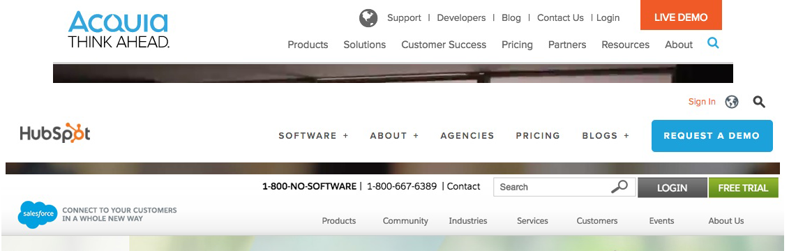
CTAs within your menu
If you are using a mega menu style (where the menu is wider and has more space than just one drop down list) you also have room to promote a relevant CTA there. I emphasise relevant because you shouldn’t just pack your menu or your site with links to assets if they don’t make sense. This will often just lower your conversion rates instead of increasing them. The goal is to place the right CTA within the right menu section, or don’t use it at all.
On acquia.com we use this CTA space in our about menu drop down section to feature a new job listing, or under our products menu to highlight our free trial. We don’t just promote random assets in these places, we want them to aid in the user's journey. I’d recommend you test these out for yourself because what works for our company might not work for yours.
Great and thoughtful UX (user experience)
The key to increasing conversions on your website is making sure your content flows the way the user expects it to. Don’t start your product pages pushing a demo when the user doesn’t know what the product does yet. Make sure you’ve provided the proper context before pushing a form. I’m sure your goal is to drive leads, but you really only want quality leads (actual information vs mickey mouse that you can pass over to sales), so think about where the user is in their journey to purchase your product and present content that matches that. We tag our content by stage in the customer journey — education, solution, vendor selection — so we can target relevant content at groups of users based on their stage (education, solution, vendor selection) and present different assets at different stages of their journey. This allows us to show more of our content to our users and it is more relevant to the user at the time. It should also result in an increase in your clicks and conversions.
Optimize your conversion landing pages
One best practice on your conversion landing pages is to remove all other possible actions besides filling out the form (such as header menu and footer) to make sure they don’t get distracted. I am of mixed opinions on this because I have seen it work, but I feel forcing users onto a landing page with no navigation while naturally navigating your main website is a bad user experience (UX). I believe this mentality belongs on paid search landing pages. If this page is on your main website which is found via organic search I think it should be in the context of your website head/footer to give consistent UX. This is also a cue to you as the site manager if your users aren’t converting and clicking other places. This might indicate that they didn’t land there at the right time for them, and you should review your UX or content again. This is also a great place to do some A/B testing around headlines, copy, submit button text, and length of your from. Continually optimize your pages to ensure the best conversions.
Personalization
Personalization is the next level of a good user experience. You want to show relevant and like content to your users based on how they are using and navigating your website. Build extensive profiles of your users and use that data to present the right assets at the right time. There are lots of ways to tackle this, I recommend starting small and working your way up, starting with the largest pool of content. Learn more about kickstarting your personalization plan.
Track and Optimize
Now that you have the outline, you need to ensure you’re tracking your data and continually reviewing it to improve upon or adjust content and your site experience as needed. I recommend tracking on a weekly and monthly basis, which you can adjust as needed. You don’t want to set it and forget it to find out later your adjustment didn’t work as expected. Learn more about the best marketing metrics to track, and how often.
Not every solution works the same for each business. I recommend a crawl, walk, run mentality when making these types of changes and adjustments to your website. If you change too much all at once you won’t be able to pinpoint what specific change improved or hurt your conversions. Your website is a huge asset to your business, so be mindful and intentional when making these changes. Identifying the need is the right start, and then you can take baby steps from there.