Increase your conversion rates with form optimization
Does your business rely on form fills (leads) to keep sales teams employed? Is your marketing team tracked on the number of MQLs (marketing qualified leads) they pass over to sales? This is the nature of the B2B beast in most cases. There is, however, some conversation happening around the idea of removing forms and not gating any content, and instead delivering a product experience that will push better qualified leads to your sales team. My friend, Tom Wentworth, has a good post on this topic. While this idea is great, it doesn’t work for every business.
So what do you do if you have a bunch of forms on your site? You optimize them! I’ll show you how.
Page Layout:
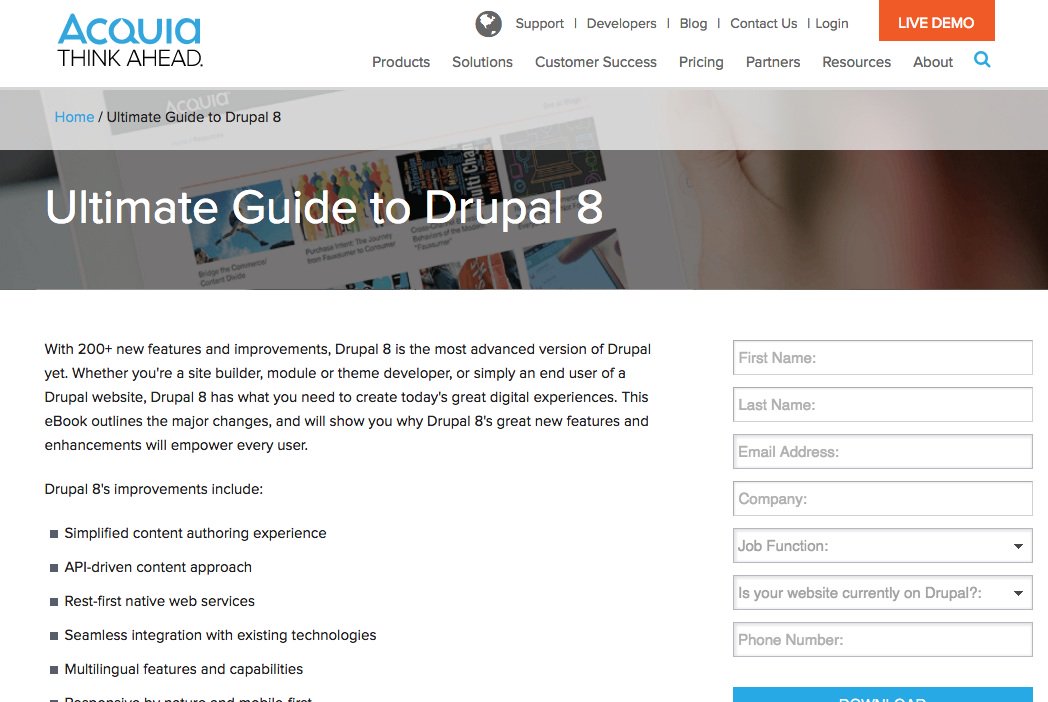
The first place to start is to consider your page layout and the copy on the page. You want to show the user this is a gated page by putting the form high on the page (above the fold) so that they don’t get the wrong idea of your goal and become frustrated later. You also need to write the page copy in a way that gives value to the form. No one wants to give away their contact info for free, so you need to show the value of the asset you are about to provide to make it worth their time and their contact details to view it.
Form Length:
- Depending on your business, the length of your form will depend on the following variables:
- What are you providing, and is it worth it the customer to fill out any fields? For example, think about the difference between infographic vs. demo forms.
- Where in the buying cycle does this offer apply? Will the user be ready to go to sales after reading it, or will they initially need to be nurtured?
- Is the user creating an account and registering, or just filling out a form?
These types of variables will have an impact on what is acceptable for a form, and will affect conversion rates if improperly applied. As a rule of thumb, less is usually better, but users do understand that to get something they really want they will need to trade you for it.
You also need to highly consider your audience. For example, business users are more used to and ok with filling out a form and providing information about themselves. The developer audience in our case, however, hates forms, and hates sharing their information.
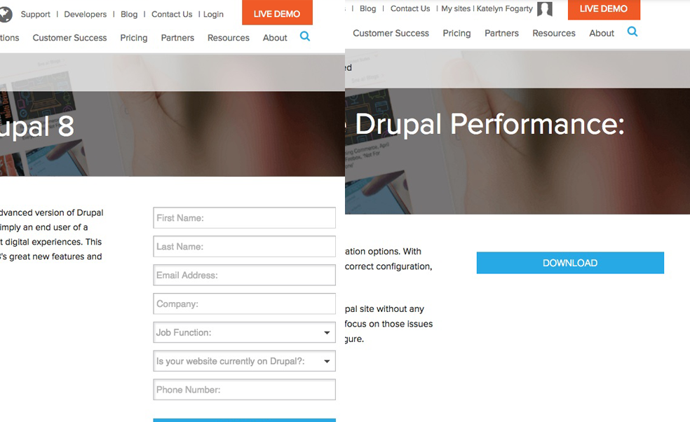
Submit buttons:
Increase your form fills by testing out button copy on your submit button. Forms using the default ‘Submit’ text see a 3% decrease in conversions, according to a Quicksprout infographic on form conversion. They recommend using relevant, non-intimidating text for your buttons such as ‘Download,’ ‘Click here,’ ‘Go’ and so on.
Also, set the user’s expectation regarding the action that will result after filling out the form. This could include landing on a new PDF page, or being sent an email with the PDF included. And if they are going to stay on the site to receive a PDF, try the wording “Download PDF” instead of “Download Now” to see how that performs. Be kind to your users and don’t say “Buy now” if they will need to complete 3 more steps before they actually get to purchase.
Regardless of your button wording choice, be sure to test these options for your site because every site will perform a bit differently. You can also use services like Acquia Lift to help you with A/B testing, to see what wording choices drive more form fills.
Know your users:
If you have the ability to remember your users and show them less fields the next time they come to your site, do it! Hiding fields they’ve previously filled out helps streamline the content getting consumed by your users. You want both new users and returning users to read your content, so making it a bit easier for your known users when they return will help you and build a better experience for them. I know this can be a bit limiting based on the marketing automation system that you're using, but it’s definitely worth looking into.
Extras:
- In doing my research for this post, I found some conversations about a few extra things that are worth mentioning.
- It’s important to care about your users’ privacy. To show them that you care, place a link to your privacy policy on your form. When adding CAPTCHA to a form, it’s best to use Smart CAPTCHA, or don’t use it at all. This can be a great spam blocking tool, but it can also cause lots of pain for real users, so be careful with it.
- The phone number field can be a big cause of form abandonment as well, so test this field on your forms to see how it behaves for you. Some research shows that just having a phone number field will cause a 5% dip in conversion and a 36% form abandon rate.
- Give your form a proper title and label. Providing more context for the user is always a good thing. Make sure your form has an enticing title to help show the user why this is valuable to them.
Wrapping it all up
Form conversion is very important to the web in general, so knowing your users and using some of these helpful tips or guidelines is the best place to start. The key rule is to test these out for your specific website. Just because they worked for me or others doesn’t mean this is an exact science. Use this blog post as a guideline to figure out your success story.