Mobile Optimization - SEO and layout best practices
Mobile traffic is crucial to any digital strategy. SimilarWeb's State of Mobile Web US 2015 report states that 56% of all traffic to websites is mobile traffic. At Acquia, we saw our own mobile traffic grow by 17% from 2014 to 2015. But things really got interesting in the past twelve months. The first half of this year saw our mobile traffic expand by 50% alone. So yes, we really care about the mobile experience on our site. Where do you start to make sure you put your best mobile foot forward?
When I think “Mobile Optimization” I think two things: search engine optimization (SEO) for mobile and delivering a web layout optimized for mobile browsers. When optimizing for Google search, Google cares about both of these items. Let’s start by focusing on mobile SEO.
Basic SEO
The first thing you need to do is make sure your overall site is optimized for SEO. This gives you a strong base to start from. If you aren’t sure your site is generally well optimized, then read my previous blog about SEO Optimization.
Page speed
Mobile users are typically on the go and want info quickly on sometimes iffy connections. Page speed is very important for mobile, so you’ll want to see if you can minimize your code, and go on a “page weight diet.” This will force you to rely on redirects less and use caching services such as CloudFlare or other CDNs as much as possible.
Optimize page titles and meta descriptions
You have less space to play with on mobile, so being concise is important to utilize the limited screen space you have. This will help in search engine results pages (SERP) and ultimately aid users in getting to your site.
Schema.org
With limited space overall, having structured data and rich snippets available on your site will add value to SERPs.
Don’t use Flash
I haven’t seen Adobe Flash used in a while, but mobile browsers can’t support these effects, so use HTML5 instead if you need the kind of effects that Flash offers.
Don’t use pop-ups
Pop-ups may seem like a great idea, but they cause lots of problems on mobile. I’ve seen scenarios where I’ve scrolled to the bottom of a page, clicked on something and then the screen turns grey but I see nothing new. Where is the pop up? Or the dreaded, “I-can’t-close-the-pop-up” syndrome. Don’t force users to leave your site. Bad pop-ups will drive them away forever.
Responsive design is a method for building pages so your site will re-format on the fly and expand and contract as needed on different mobile devices. This means a user can grab the bottom left corner of a site on desktop and as they make the browser window smaller the elements on the page will restructure and move to optimize and align to fit the new browser size. I like this method best because you don’t have to maintain a separate mobile-friendly website (who has time for that?!) and you ensure you are showing the same information to all your audiences. There is nothing worse than telling a friend to go check something specific out on a certain website, only for them to load the site in mobile and it isn’t there.

Mobile-Friendly design is when your site will adjusts to ensure a user can easily navigate and read your site from their mobile device. Techniques such as making the menu larger so the user can easily click on links with their finger are mobile-friendly elements. This also adjusts the layout for ease of reading and scrolling.
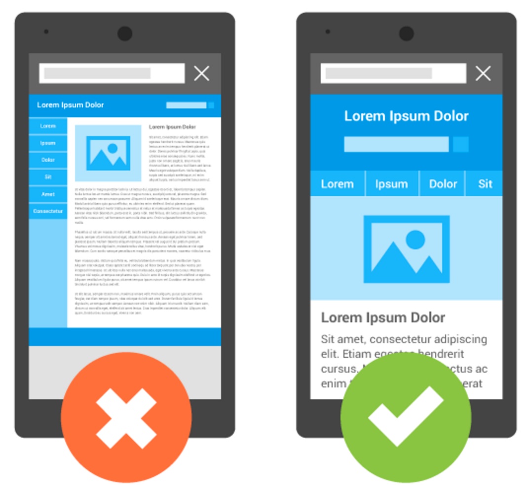
(image referenced from https://developers.google.com/webmasters/mobile-sites/)
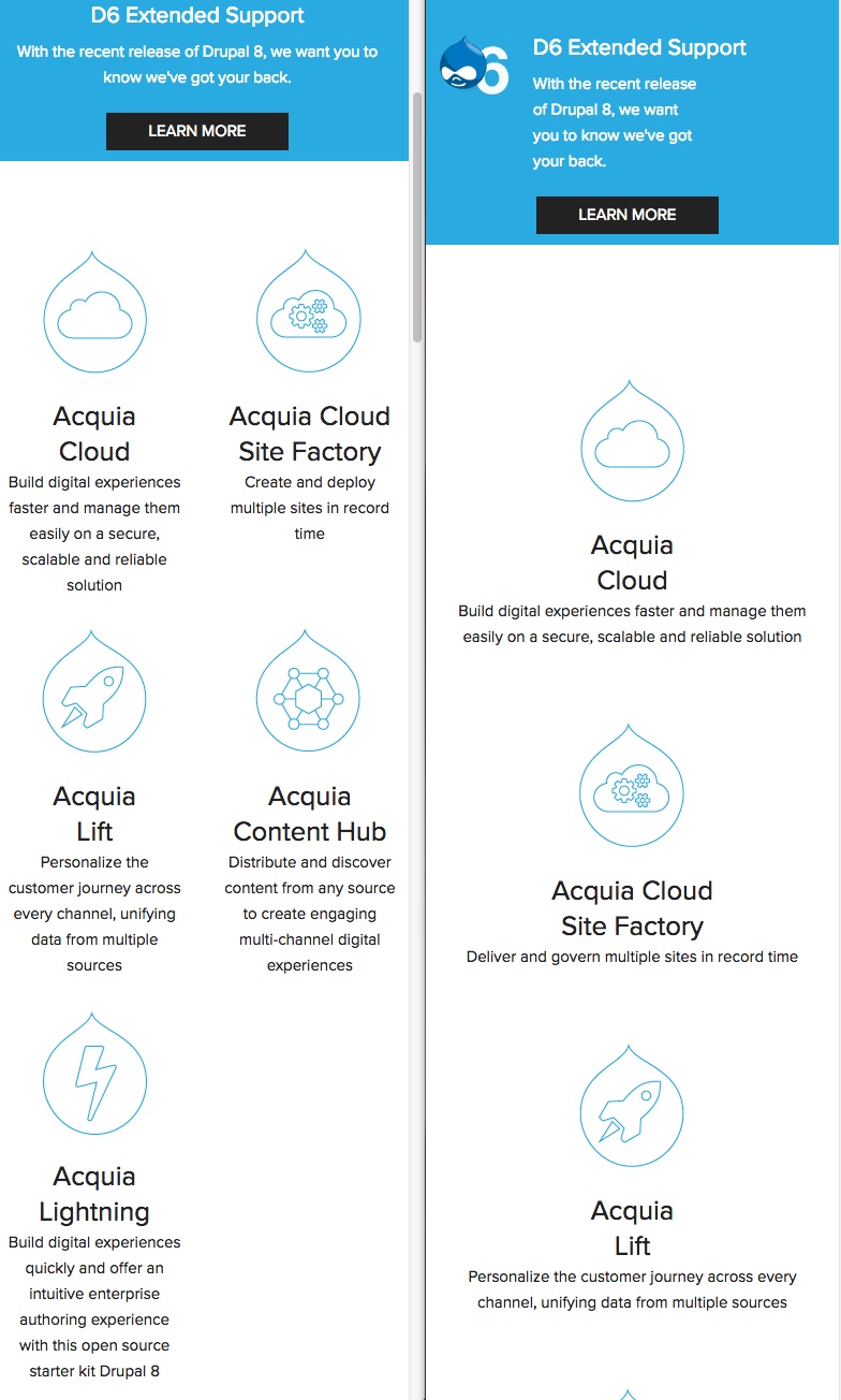
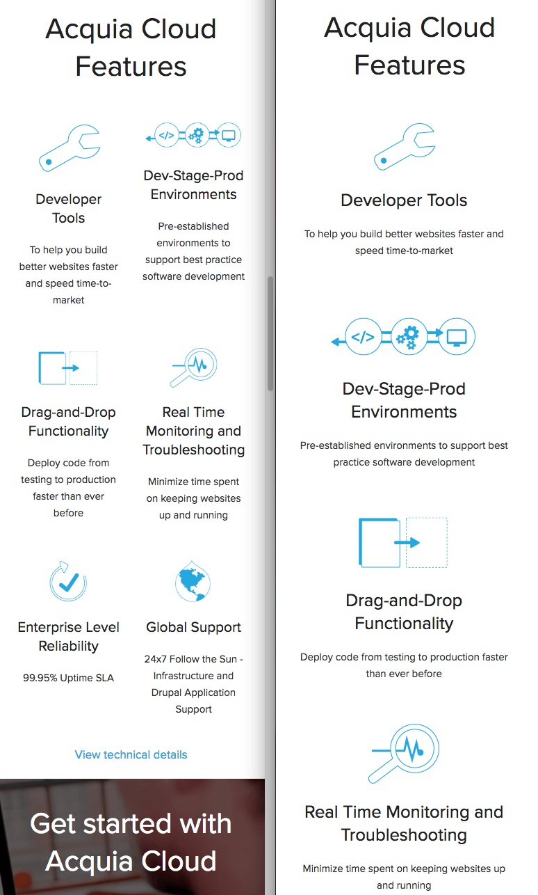
On Acquia.com we took “mobile optimization” one step further. When we first re-launched our homepage, we made all new images/icons full width for mobile. This made our homepage extremely long, and while scrolling is more acceptable on mobile it still wasn’t a good use of our space. So we took another look at our mobile experience and were able to utilize the mobile space much better, here are a few images of what we did:
Mobile is continuing to grow and isn’t something we can ignore. So let’s embrace it!
Referenced materials:
https://developers.google.com/webmasters/mobile-sites/
http://marketingland.com/mobile-top-sites-165725
https://moz.com/learn/seo/mobile-optimization
http://signalfire.us/blog/what-is-responsive-design/